
Report
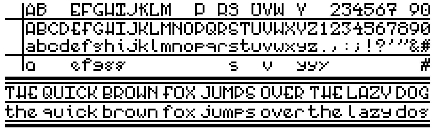
A low-resolution "art deco" bitmap font I've been designing (more information in comments, looking for opinions/feedback)


Report
About this ad
Sort by:
Sort by
Best
Open comment sort options
Best
Top
New
Controversial
Old
Q&A

Comments Section
As a personal art/design project I've been working on an alternate history where the Analytical Engine was successfully built in the mid-1800s and the computer revolution began early. I'm currently designing an early business computer from the late 1920s/early 1930s (similar in capabilities to real-world business computers from the 1950s-1960s), and I needed a font that wouldn't look out of place. It uses an electromechanical display similar to the modern "flip dot" display, which requires an extremely low resolution bitmap font (5x7 pixels). I'm not basing it on any particular real-world typeface, just pulling various design features that were popular at the time and trying to fit them into the 5x7 grid. The lines above and below the main alphabet are alternate designs.
I know there are some imperfections and inconsistencies (some of which are due to the limitations of the 5x7 pixel character size, like the fact that the midpoints of A, H, P, R, etc. are different from the midpoints of B, E, F, S, etc.), but I'm wondering what others think of the design. Also, I figure some slight oddities would add to the realism, as the font would theoretically have been designed by engineers rather than typographers.
Really good, looks great. The only thing I'd say is the lower case 'g' looks like an 's'. So just reading it normally it looks a lot like "lazy dos". I think it's the top-right pixel. I think get rid of the little flick on the top right.
The lower case g is one of the letters I'm having the most trouble with, along with the lower case y (although that one is not so much a legibility issue as a style issue). Just to clarify, since it may be unclear, I'm trying to make a "double-story" g. Here's a modified version of the character, with the implied parts that wouldn't fit in grey. 5x5 pixels just isn't enough to work with for lowercase letters with descenders, especially one as complex as the "double-story" g. The obvious solution is to just use a "single-story" g, and that's probably what I'll end up doing, but I haven't quite given up yet.
Thanks for the feedback.
I like it.
I understand why you did the baseline adjustment on the lowercase g and q but I feel they need work
I'm still working on both of those and I'm really not happy with them myself, but 5x5 pixels isn't much to work with. I have a few other alternatives that I've been working on, but none of them are particularly legible/good looking.
I like it! Will you be making it available for download? Would love to use it if you do.
It's still in the design phase, and right now it only exists as a pixel drawing, so I don't know if I will make it a functional font yet. Pretty much all the uses I have planned at the moment would most easily be done by "drawing" it in pixel by pixel, so making it functional isn't really a priority. I may try to program it into my Apple II for fun though...
The S looks very 6ish to me. This looks awesome overall though.
I like it, it looks like a needlework sampler.